What causes bad air quality in Lane County?
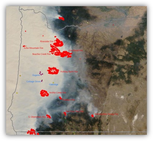
Image 1. Satellite imagery of wildfire smoke in Oregon on September 10, 2020.
There are many sources of air pollution that can affect air quality. In Lane County, the worst air quality is created by both local and distant wildfires. However, human-generated sources of air pollution like wood stoves, fireplaces, car exhaust, and industrial emissions can also contribute to poor air quality.
Wildfire season can begin as early as May and continue as late as November. The Pacific Northwest’s warming and drying climate has increased the length of the wildfire season. During this season, wildfires can ignite, grow, and create smoke that worsens air quality.
During the winter and spring, poor air quality generally happens during periods of air stagnation. This is when the airmass in Lane County is stationary and unmoving for multiple days – usually when a strong region of high pressure is just off Oregon’s coast. During these air stagnation events, air quality can gradually worsen as pollution continues to be added to the unmoving air. Wood stoves and fireplaces are the biggest contributors to poor air quality during these periods. LRAPA runs a Home Wood Heating program in Eugene, Springfield, and Oakridge to help protect air quality during air stagnation episodes.
How can I tell if the air quality is good or bad?
The Environmental Protection Agency (EPA) created a tool to report air quality to the public in a simple and clear way. The air quality is reported for the five major air pollutants (ground-level ozone, particulate matter, carbon monoxide, sulfur dioxide, and nitrogen dioxide) regulated by the Clean Air Act. This tool is called the Air Quality Index (AQI). The AQI is a unit-less scale of 0 to 500 that is reports how good or bad the air quality is. The higher the AQI the worse the air quality.
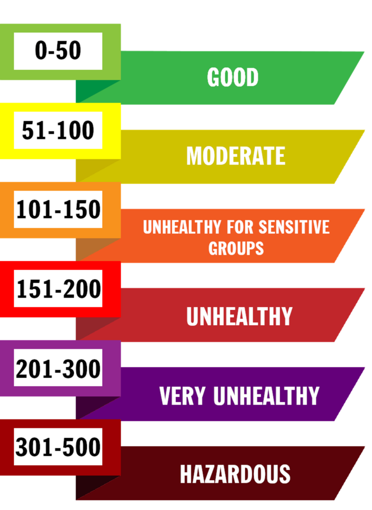
Figure 1. The Air Quality Index (AQI) categories and colors.
The AQI is divided into six color categories that report how bad the air quality is for human health. The AQI also provides recommendations to protect health.
“Good” air quality is an AQI between 0-50 and is represented by a green color. At this category air quality is considered satisfactory, and air pollution poses little or no risk.
“Moderate” air quality is an AQI between 51-100 and is represented by a yellow color. At this category air quality is considered acceptable. However, there may be a risk for some people, particularly those who are unusually sensitive to air pollution.
“Unhealthy for Sensitive Groups” air quality is an AQI between 101-150 and is represented by an orange color. At this category members of sensitive groups may experience health effects. Anyone with heart or lung disease, older adults, anyone pregnant, and children (including teenagers), are all considered a sensitive group. The general public is less likely to be affected at this category, however everyone should avoid outdoor activities that cause heavy breathing, like working out, running, or playing sports. Sensitive groups should limit how long they spend outside.
“Unhealthy” air quality is an AQI between 151-200 and is represented by a red color. At this category some members of the general public may experience health effects; members of sensitive groups may experience more serious health effects. Everyone should limit how much time is spent outside, and sensitive groups should avoid going outside as much as possible.
“Very Unhealthy” air quality is an AQI between 201-300 and is represented by a purple color. At this category, the risk of health effects is increased for everyone. When air quality is this bad outside, everyone should avoid going outside as much as possible. Wearing correctly fitted N95 masks is suggested when outside.
“Hazardous” air quality is an AQI between 301-500 and is represented by a maroon color. This category represents the worse air quality. Everyone should avoid being outside as much as possible. Leaving the area to find better air quality is recommended. Wearing correctly fitted N95 masks is also recommended when outside.
The Oregon Health Authority has published public health guidance for outdoor activities during wildfire events which uses the current AQI value and length of time students will be outside for educators to modify activities and remain protective of student health.
Should I be concerned about the air quality?
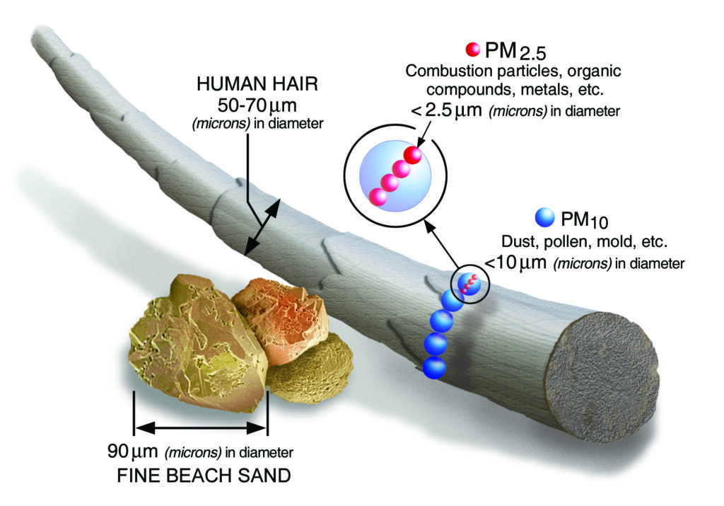
Figure 2. Particulate Matter size chart showing how much smaller PM2.5 and PM10 is than fine beach sand and a human hair.
Yes! The quality of the air is an important component of any individual’s living environment. Bad outdoor air quality and bad indoor air quality can have lasting health consequences. Air pollution has been linked to several health problems like asthma, heart disease, cancer, prolonged breathing problems, and others. The pollutants most monitored for in Lane County are Particulate Matter and ground-level Ozone.
Ozone is a colorless unstable toxic gas with a pungent odor and powerful oxidizing properties that forms in the atmosphere via chemical reaction between Volatile Organic Compounds (VOCs), heat, and ultraviolet radiation from the sun. Ozone pollution is also referred to as smog. In Lane County, Ozone is a summertime pollutant that is monitored for between May 1 and September 1.
Particulate Matter is a mixture of small solid particles and liquid droplets found in air. These particles are incredibly small, often 30 times smaller than the average width of a human hair! Particles 10 micrometers (µm) or smaller in diameter are called PM10. While particles 2.5 micrometers (µm) or smaller in diameter are called PM2.5. Because these pollutants are so tiny, it is possible for them to become entrapped deep in a person’s lungs or enter their bloodstream, which can lead to serious health problems like lung disease, hospitalization, cancer, or even premature death.
The best way to protect health is to avoid breathing these pollutants. Such as staying indoors when air quality outside is bad, and running an air purifier with a High Efficiency Particulate Air (HEPA) filter.
What should I do when the air quality is bad?
The best way to protect health during poor air quality is to avoid breathing the bad air as much as possible. Staying away from wood smoke, vehicle exhaust, tobacco smoke, and other sources of airborne particles is always recommended.
When the outdoor air quality begins to worsen, closing the doors and windows to your home is the best way to protect indoor air quality. Repairing drafty doors and windows or covering gaps with gaffer tap to improve the air seal of a home, will help preserve the quality of indoor air. Using an air conditioning unit will not bring outside air into your home, even for units installed in a window.
Running an air purifier with a High Efficiency Particulate Air (HEPA) filter is an effective way to remove particulate matter from indoor air. Furnace filters with a Minimum Efficiency Reporting Value (MERV) rating of 13 or higher are also effective at removing particulate matter from a home’s air. Those without an air purifier, or a home furnace, can create a do-it-yourself air purifier by attaching a furnace filter rated at MERV 13 or higher to a box fan and running it inside. The video below from Washington State’s Department of Ecology shows how to create a DIY air purifier.
During instances of severely reduced air quality (AQI greater than 250), wearing an N95 mask will reduce how much air pollution is inhaled. It is important the N95 mask is fitted and worn with an air-tight seal against the face, otherwise the mask will offer little added protection.
How is air quality monitored?
Air monitoring can be broken into two categories, (1) regulatory-grade monitoring and (2) commercial-grade monitoring. In general, regulatory-grade monitoring is more accurate with a higher level of precision but comes at a higher cost to install and operate the monitors. In comparison, commercial-grade monitoring is not as accurate, but is more affordable and commercially available to anyone to purchase and install. Both types of monitoring take place in Lane County.
Regulatory-grade monitors
LRAPA uses eight regulatory-grade monitors to record and report Lane County’s air quality.
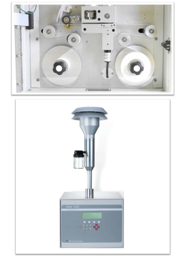
Image 2. A beta-attenuation sampler is an example of a government-grade monitor used by LRAPA.
These monitors are located at:
- Eugene, Amazon Park
- Eugene, Highway 99 & Elmira Rd.
- Eugene, Madison Middle School
- Springfield, City Hall
- Oakridge, Willamette Activity Center
- Saginaw, South Lane County Fire & Rescue Station #2
- Cottage Grove, N 14th St & E Main St.
- Florence, Department of Forestry’s Western Lane office
Data from these monitors is reported to the Oregon Department of Environmental Quality (DEQ) and the Environmental Protection Agency (EPA) to demonstrate compliance with the National Ambient Air Quality Standards (NAAQS) set by the EPA under the authority of the Clean Air Act.
These monitors are costly to install, maintain, and operate. Visit the air monitoring webpage to learn more about LRAPA’s regulatory-grade monitoring.
Commercial-grade sensors
Technological advancements in the late 2010s have allowed forms of commercial-grade Particulate Matter 2.5 (PM2.5) monitoring that provide reliable and meaningful information about the quality of the air – most notably are PurpleAir Sensors.
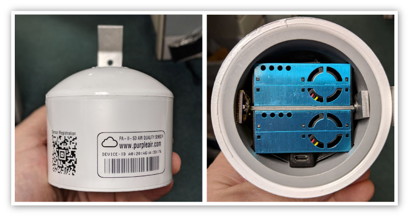
Image 3. A PurpleAir sensor which is a common commercial-grade monitoring device.
As of 2022, the overwhelming majority of commercial-grade sensors on the market only monitor for Particulate Matter air pollution. These devices, while not as accurate as regulatory-grade monitoring, are precise enough to reliably report the quality of the air. Commercial-grade monitoring is often significantly more affordable which allows more sensors to be deployed in an area.
LRAPA began installing PurpleAir sensors across Lane County in 2017 to increase the public’s access to air quality information near them. By the end of 2022, just over 100 sensors have been installed with 70-80 in active operation reporting real-time air quality data accessible to the public.
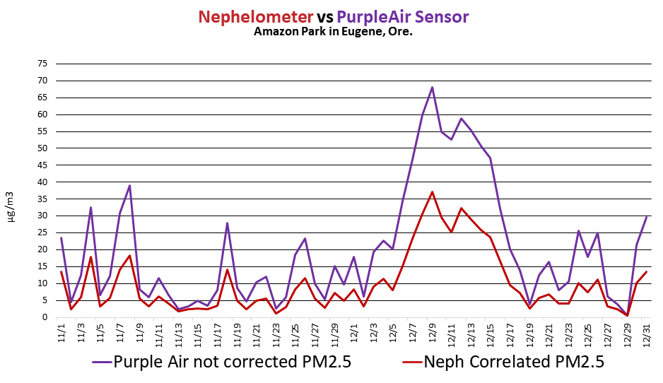
Raw PurpleAir data has a high bias when compared to more accurate and more precise government-grad monitoring.
PurpleAir sensors, while not as accurate as regulatory-grade monitoring, are remarkably precise. This means a senor’s initial reading of PM2.5 pollution is higher or lowers than more accurate monitors, but the sensor reliably reflects changes in air quality when compared to LRAPA’s regulatory-grade monitors. Figure 3 is a graph showing the high bias seen with PurpleAir sensors.
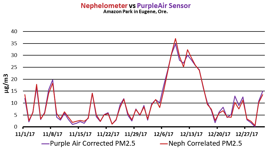
Figure 4. When a correction factor is applied, PurpleAir data very closely matches more accurate government-grade monitoring.
To account for PurpleAir sensors’ high bias, a correction factor must be applied to the data. Figure 4 is a graph of PurpleAir sensor air quality data with a correction factor applied, compared to a regulatory-grade monitor located next to the PurpleAir sensor.
It is important to remember that anyone can purchase and install a commercial-grade sensor. It is possible for a sensor to be installed at a different location than what is reported on the PurpleAir map, or installed in a poor location that does not fairly represent the ambient air quality (such as near a barbeque grill, or recreational fire pit). Always maintain a healthy dose of scrutiny and skepticism when checking commercial-grade air quality information.
How can I look up the AQI?
There are many sources of the Air Quality Index numbers online. These sources can be grouped into two different categories, (1) government sources of AQI, and (2) commercial sources of AQI. There are differences between these two categories that are important to understand when checking the AQI.
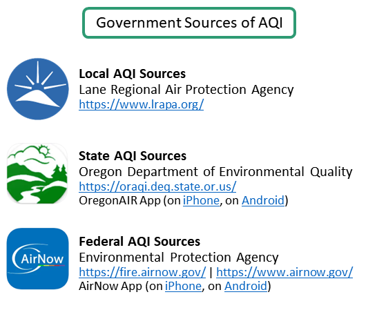
Figure 5. Government Sources of AQI numbers.
Government sources of AQI
The most reliable source of air quality information comes from government sources. This is because the data published by government sources is primarily from the more accurate and precise regulatory-grade monitors. Also, the information undergoes a data quality assurance and quality control process before it is published. Greater confidence can be placed on AQI information from government sources than commercial sources.
Lane Regional Air Protection Agency (LRAPA)
As the local air regulator, AQI numbers for Eugene/Springfield, Cottage Grove, Oakridge, and Florence are published on LRAPA’s homepage, and current air quality webpage. The Eugene/Springfield AQI number displayed is always the highest AQI value of the four regulatory-grade monitors LRAPA has in Eugene and Springfield.
Oregon Department of Environmental Quality (DEQ)
As the state air regulator, DEQ also publishes AQI numbers from regulatory-grade monitors across Oregon. DEQ’s Air Quality Monitoring map is a helpful resource to see the AQI for all regulatory-grade monitors in Oregon. DEQ also offers the OregonAIR application on iPhone and Android devices as a convenient way to access AQI numbers from regulatory-grade monitors in Oregon.
Environmental Protection Agency (EPA)
The federal government publishes AQI numbers from regulatory-grade monitors across the United States. The EPA’s AirNow website is a valuable resource to check the AQI for any location in the United States.
The EPA also publishes a Fire and Smoke Map, which is the only way to access commercial-grade AQI numbers from a government source. LRAPA highly recommends this resource as it also provides wildfire information and plots smoke plumes from fires. Smoke and air quality outlooks are published for large fires burning in the United States. The Fire and Smoke Map is available as an application for iPhone and Android devices.
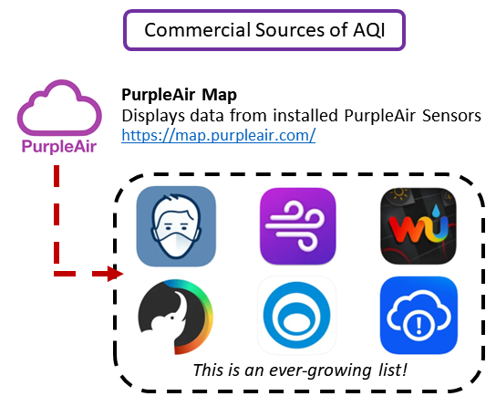
Figure 6. Commercial Sources of AQI numbers.
Commercial sources of AQI
There are too many websites and smartphone applications that publish AQI information to list here. However, many of these commercial sources of air quality information display data received from the commercial-grade PurpleAir sensors. It is important to scrutinize air quality information from a commercial source and less confidence should be placed on AQI information from commercial sources than government sources.
While data from the PurpleAir sensors is utilized by many websites and apps, the information can be directly accessed from the PurpleAir Map.
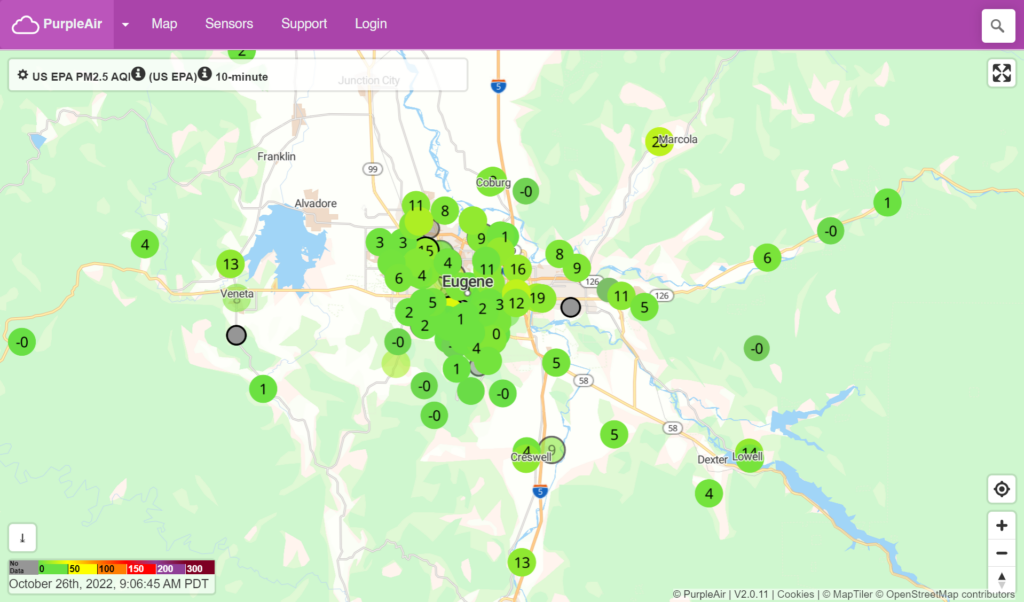
Figure 7. A map of PurpleAir Sensors in the Eugene/Springfield metro area as of October, 2022.
What is different about government sources of AQI and commercial sources of AQI numbers?
There are a few differences between air quality information from government and commercial sources. The most notable difference is amount of time and method being used to determine an AQI number.
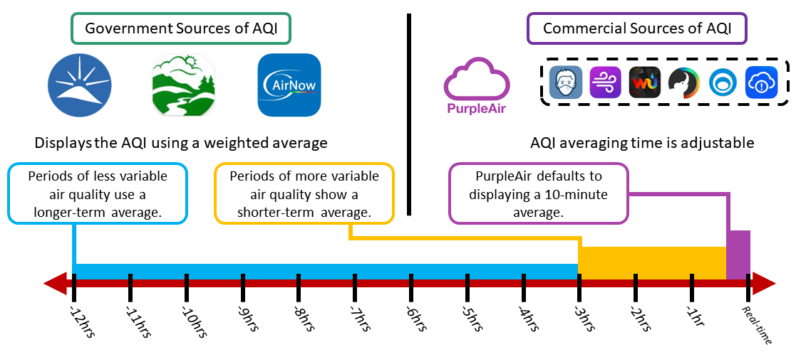
Figure 8. Government and commercial monitoring use different timescales to display information. Government sources use a 3-12 hour weighted average (more weight is given to the most recent hours), while commercial sources can vary and generally default to a 10-minute average.
Government sources of AQI numbers update hourly and use a “weighted average” with more weight is given to the most recent data, to establish an AQI value. Commercial sources, such as the PurpleAir map, update continuously and default to displaying an average of air quality over the last 10-minutes. The purple air map also displays sensors that are placed indoors, and the air quality data needs to have a “conversion” applied to the data to account for the high bias in PurpleAir sensors shown in Figure 1.
The weighted average used by government sources to calculate AQI will average anywhere between the last 12 to last 3 hours of air quality data. During periods when air quality is changing little, a full 12-hours of air quality data is averaged to calculate the hourly AQI number. When air quality is changing quickly, only the last 3-hours of data is averaged to calculate the hourly AQI number.
In comparison, the PurpleAir map defaults to averaging the last 10-minutes of data in its AQI calculation. This averaging period can be changed on the map’s settings to either real-time, 10-minute average, 30-minute average, 1-hour average, 6-hour average, 1-day average, or 1-week average.
It is important to keep this averaging difference in mind when looking at AQI information. This is because when air quality is changing rapidly (such as when wildfire smoke is present in Lane County) government AQI numbers can be significantly different from commercial AQI numbers.
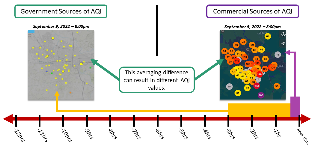
Figure 9. When air quality is changing quickly, AQI numbers can vary dramatically between government and commercial sources of AQI as seen in this example from September 9, 2022 at 8:00pm.
What else should I know about the PurpleAir sensors and commercial-grade monitoring?
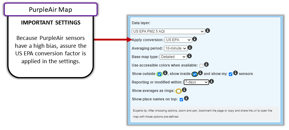
Figure 10. Apply the US EPA conversion in the PurpleAir map settings to assure AQI numbers displayed are representative of the actual air quality.
As of 2022, commercial-grade monitoring is primarily limited to monitoring for PM2.5 air pollution. Poor air quality caused by other pollutants – such as ozone – will not be represented on the PurpleAir map or other forms of commercial-grade monitoring. As technology improves and evolves, it is likely additional pollutant types will be monitored with commercial sensors.
Be sure to remember that PurpleAir sensors have a high bias. This means PurpleAir sensors report more PM2.5 air pollution than the more accurate and precise government-grade monitors. To account for this high bias, apply a conversion factor in the PurpleAir map’s setting. There are multiple conversion factors to choose from, including one LRAPA created in 2017. However, LRAPA recommends using the US EPA conversion, which was created in 2021 and more correctly adjusts PurpleAir data when AQI numbers are above 100.
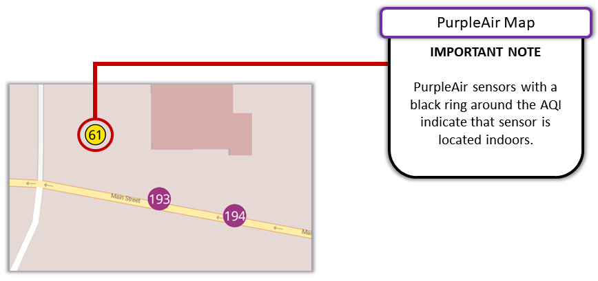
Figure 11. A black ring around a AQI number on the PurpleAir map means that sensor is indoors.
Another detail to note is that PurpleAir sensors with a black ring around the AQI number indicate that sensor is inside and does not represent outdoor air quality.
Where can I learn more information about air quality monitoring and citizen science?
The South Coast Air Quality Management District (AQMD) has published a Sensor Educational Toolkit, “Community in Action: A Comprehensive Educational Toolkit on Air Quality Sensors” that includes a guidebook and videos to help individuals and community groups interested in citizen science understand why it is important to measure the air quality, the basics of and how to monitor the air quality using sensors, and the process of setting up commercial-grade sensors like a PurpleAir sensor.
The toolkit includes a guidebook to help support communities and individuals to effectively use commercial-grade sensors. The three videos posted here also provide good, concise overviews.
Air Sensor Training #1: Community in Action – A Comprehensive Guidebook on Air Quality Sensors is a video providing an overview of the AQMD’s guidebook and how it can be used to effectively monitor the air quality.
Air Sensor Training #2: Understanding Air Quality and Monitoring, describes what effect poor air quality can have on a community and the environment. The video also details the multiple types of air pollutants and their sources.
Air Sensor Training #3: PurpleAir PA-II Sensor Installation, has a review of PurpleAir sensor monitoring and some useful tips during the installation process of a PurpleAir sensor.
How is the Air Quality Index (AQI) calculated?
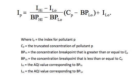
Figure 12. The equation used to arrive at an AQI value for a pollutant.
The PM2.5 AQI is an index developed by various governmental agencies such as the US-EPA, or China’s CNEMC, to convey how polluted the air is with respect to PM2.5. The computational formulae used for AQI calculation varies depending on the regulatory jurisdiction. For the purpose of our discussion, we will use the computations used by the US-EPA.
As we shall see, the AQI is not always a good predictor for future air quality. Unlike direct PM measurements, AQI is a unitless number that varies from 0 to more than 500. PM2.5 AQI is a midnight-to-midnight 24-hour value based on 1-hour measured values. The PM2.5 AQI is computed from the following formula where Ip = AQI. See figure 12.
24 1-hour measured PM values from midnight to midnight are needed to compute the Air Quality Index “AQI.” In this computation, it is necessary to know the breakpoints between the AQI categories. These are given below in Table 1.
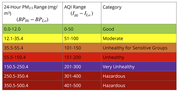
Table 1. PM2.5 Air Quality Breakpoints
In Table 1, the first column shows the 24-hour PM2.5 range (low breakpoint to high breakpoint) for “Good” air quality. This corresponds to an AQI ranging from 0 to 50. Therefore, if the 24-hour integrated PM2.5 concentration were 6.0 mg/m3 (Cp), BPHi would be 12.0 mg/m3, BPLo would be 0 mg/m3, circumstances IHi would be 50, and ILo would be 0. The PM2.5 range of 0 mg/m3 to 12 mg/m3 corresponds to the AQI range (IHi − ILo). Therefore, for a daily PM2.5 average concentration of 6.0 mg/m3, the AQI would be calculated in the following manner:
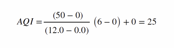
Figure 13. An example of calculating the AQI.
A PM2.5 AQI of 25 denotes good air quality and would be in the “green” zone. We will determine the AQI for actual PM data collected from our Grants Pass, Oregon corporate headquarters during a fire event during the summer of 2018. Table 2 shows AQI being calculated from actual hourly PM2.5 data collected during July and August 2018 at the beginning of a smoke episode.
As can be seen from Table 2, the maximum hourly PM2.5 concentrations often substantially exceed the daily PM2.5 average. The AQI is only available for the previous, complete 24-hour period meaning that this index is not useful for reporting current conditions because current PM2.5 measurements will not be incorporated into the AQI until the following day.
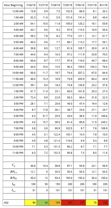
Table 2. PM2.5 Data concentrations from a regulatory-grade monitor called a BAM 1020.
Hourly PM Concentrations mg/m3 and the NowCast AQI
Consequently, the US-EPA developed an alternate air quality index known as NowCast AQI that uses the most currently available hourly PM2.5 air quality data to compute the NowCast index. NowCast relies on the most recent 12-hour period of air quality data to compute the index. However, because of weighting factors in the NowCast computational algorithm, during periods of rapidly changing PM2.5 concentrations (either up or down), NowCast closely tracks a 3-hour average converted into an AQI. During periods where the PM2.5 concentration is not rapidly changing, it does not. NowCast, therefore, has the advantage of being based on the most recent air quality data.
The NowCast computation for PM2.5 is taken directly from the US-EPA airnow.gov Website.
Use the past 12 hours of PM measurements in micrograms per cubic meter (μg/m³):
- Select the minimum and maximum PM measurements.
- Subtract the minimum measurement from the maximum measurement to get the range.
- Divide the range by the maximum measurement in the 12-hour period to get the scaled rate of change.
- Subtract the scaled rate of change from 1 to get the weight factor. The weight factor must be between .5 and 1. The minimum limit approximates a 3-hour average.
- If the weight factor is less than 0.5, then set it equal to 0.5.
- Multiply each hourly measurement by the weight factor raised to the power of the number of hours ago the value was measured (for the current hour, the factor is raised to the zero power).
- Compute the NowCast by summing the products from Step 6 and dividing by the sum of the weight factor raised to the power of the number of hours ago each value was measured.
- Convert this value to an AQI. A concentration-to-AQI converter is available on the EPA’s website: NowCast Calculator.